
“Please alter my pants as fashion dictates.” – Jasper (as read by Homer Simpson)
Last month, when I was taking all those frame grabs of the seated Cerberus that was the three housewives from “Moms I’d Like to Forget”, I was struck by how modern and colorful their outfits were compared to Marge’s. The next week I noticed something similar in “Flaming Moe”. Characters who’ve been around a long time, like Smithers and Patty, look really out of place next to the one-and-done guests. The more I thought about it, the more it occurred to me that this happens in almost every episode. They come up with some one off character or just have a celebrity on, and s/he looks wildly different than the long time characters in the same shot.
This is another example of how you can’t keep the show from aging, even if you nominally keep the characters from aging. Characters that were originally designed to catch the eye in low definition at a time when televisions were a lot smaller don’t scale up well to HD resolutions. The basic character models (Marge’s green dress, Homer’s white shirt, etcetera) are big on solid colors and low on minute detail. But new characters, who are supposed to be twenty-first century Americans, can’t be drawn the way the Simpsons are, it would look terrible. Instead they animate new characters as realistically as possible and just ignore the clashing styles.
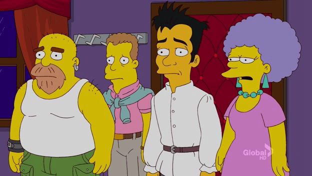
Look at Patty’s clothes compared to the gay dudes. Her dress is flat and monochromatic, their clothes are colorful and detailed. Look at the shoulders, buttons and belt of the guy in white. Look at the knotted sweatshirt; look at the precise lines of the pockets on the green pants. The three of them are massively more detailed than she is.
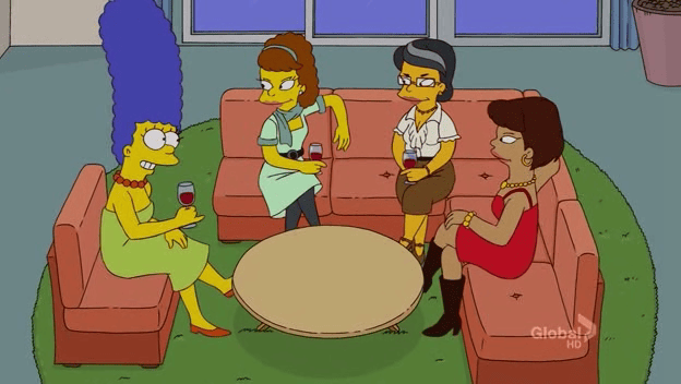
Here we can see the same thing with Marge and the Anitas. They gave Marge as many different dresses as they could (examples), but when they use her standard outfit they’re stuck with these radically clashing styles. The clothing is obvious enough, but it extends even to the accessories. Two of the Anitas are wearing necklaces that look kind of like the necklaces real women wear everyday. Next to those, Marge’s necklace is painfully cartoony. There’s nothing wrong with cartoony in and of itself, but it looks more than a little out of place next to the more realistic drawings.
This sort of thing happens all the time on Zombie Simpsons, and it’s only gotten worse since the changeover to HD. Unfortunately for us, there’s nothing they can do about it even if they wanted to. The audience accepts Marge in that uniform green dress, but if you drew other characters with the same simplicity it would look childishly primitive. And it’s not like they can change the way the main characters look, doing so would risk a New Coke level disaster.
They compensate by putting old characters in different clothes far more often than they did back in the before time, in the long long ago. Just this season we’ve seen Homer wear a sweater for most of an episode as well as go undercover for the bulk of another. Lisa’s spent significant time in school and baseball uniforms. But those sorts of temporary dodges can’t change the basic character models. They’re stuck with the fact that the default costumes for all of the main characters, and most of the secondary ones, aren’t designed for modern animation, and clash badly with newer characters that are.
fantastic observation…
I noticed this as well. And the only solution I can think of is to make it clear that Springfield is culturally retarded. They don’t know what the latest trends and fashions are.
Agreed 100%. The style of the original characters is very bizarre, but works so well with the original animation that everyone seems to loathe so much. Their basic clothes and silly hairstyles worked so much better when it was a cartoon – it’s not a cartoon anymore, it’s an animated TV show that’s tried to move on with the times… and failed, as you mention.
As much as you’re right that it wouldn’t make sense for them to simplify their one-off creations in the context of HD, it really bugs me just how much they ‘flatter’ their new characters, be they guest stars or simply convenient for the plot. Cartoon characters aren’t meant to be attractive (unless it’s Bugs Bunny cross-dressing, of course), they’re meant to be humorous. In my opinion, they shouldn’tve tried to move on with the times as much as they did – it would be naïve to imagine they wouldn’t use modern technology, but if they’d stubbornly decided to stick to the basic (non-HD) designs… well, it would still be rubbish, because the writing isn’t what it used to be… but we’d have one less thing to moan about.
On another note, I was thinking about the ‘That is so 1991’ quote on my drive to work this morning… weird…